NBA Age Analysis
date published: April 12, 2021 read time: 5 mins## loading R packages.
library(pacman)
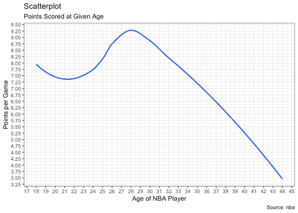
pacman::p_load(ggplot2, here, readr, dplyr, Stat2Data)Figure 1: Scatterplot of Points and Age
Load/read in the data.
nba <- read_csv("../data/nba_players.csv")head(nba)## # A tibble: 6 x 22
## X1 player_name team_abbreviati… age player_height player_weight college
## <dbl> <chr> <chr> <dbl> <dbl> <dbl> <chr>
## 1 0 Dennis Rodm… CHI 36 198. 99.8 Southea…
## 2 1 Dwayne Schi… LAC 28 216. 118. Florida
## 3 2 Earl Cureton TOR 39 206. 95.3 Detroit…
## 4 3 Ed O'Bannon DAL 24 203. 101. UCLA
## 5 4 Ed Pinckney MIA 34 206. 109. Villano…
## 6 5 Eddie Johns… HOU 38 201. 97.5 Illinois
## # … with 15 more variables: country <chr>, draft_year <chr>, draft_round <chr>,
## # draft_number <chr>, gp <dbl>, pts <dbl>, reb <dbl>, ast <dbl>,
## # net_rating <dbl>, oreb_pct <dbl>, dreb_pct <dbl>, usg_pct <dbl>,
## # ts_pct <dbl>, ast_pct <dbl>, season <chr>This is dataset is exported from Kaggle and contain biometric, biographic and basic box score features of NBA players from 1996 to 2019. It has ~10k rows.
# Plot code here
options(scipen=999)  # turn-off scientific notation
library(ggplot2)
theme_set(theme_bw())
gg <- ggplot(nba, aes(x=age, y=pts)) +
  geom_smooth(method="loess", se=F) +
  scale_y_continuous(breaks=seq(2,10,0.25)) +
  scale_x_continuous(breaks=seq(10,50,1)) +
  labs(subtitle="Points Scored at Given Age",
       y="Points per Game",
       x="Age of NBA Player",
       title="Scatterplot",
       caption = "Source: nba")
plot(gg)
## `geom_smooth()` using formula 'y ~ x'This is a plot of age on the x-axis and points scored per game (ppg) on the y-axis. You can see that players, on average, approximately peak at 28 years of age with 9.25 ppg.
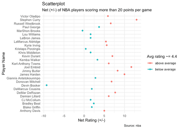
Figure 2: +/- Analysis
# Plot code here
s2017 = nba[nba$season=='2017-18',]
s2017 = s2017[s2017$pts>20,]
avg = mean(s2017$net_rating)
print(avg)
## [1] 4.381481theme_set(theme_minimal())
ggplot(s2017, aes(x=net_rating, y=player_name, col = ifelse(net_rating > avg,'above average','below average'))) +
geom_point() +
geom_smooth(method=lm, se=FALSE) +
theme(legend.position="right") +
labs(subtitle="Net (+/-) of NBA players scoring more than 20 points per game",
y="Player Name",
x="Net Rating (+/-)",
col="Avg rating ~= 4.4",
title="Scatterplot",
caption = "Source: nba")## `geom_smooth()` using formula 'y ~ x'I created a sample of the data called s2017. This sample only contains data from the 2017-18 NBA season and players who scored more than 20 points. Then, I took the average of the Plus Minus Statistics (+/-) and plotted the players with a color code based on whether they fell below or above this average which came out to +4.381481. You can see that Stephen Curry, Joel Embiid, and James Harden lead the pack of players with a high (+/-), wile Devin Booker has the lowest (+/-) by far with nearly -10.
Plus/Minus (+/-) reflects how the team did while that player is on the court. If a player has a +5 PM, it means his team outscored the opponent by 5 points while he was on the court. If he has a -3, then the opposing team outscored his team by 3 points while he was on the court.

